
Having specialized in health club design for the past nine years, I have seen many changes in this industry. At one time all a facility needed to do was provide decent equipment, paint the concrete block and add a heartbeat stripe on the walls above the Cardio area and you had a gym. But then everybody started to see that a large segment of the population didn't workout. This potentially lucrative group is led by the baby boomers. Average people that understand health is very important, especially as the get older. People didn't just want to bulk up, most wanted to lose weight, get healthy and live longer. Service and fitness programs were developed to accommodate this group. As the science of health and fitness progressively became more sophisticated, so did the science and art of facility design. The challenge now is to design unique and exciting spaces that accomplish three primary goals.
1. Wow a potential member to join.
2. Keep a member from defecting to another club.
3. Or worse, having an existing member quit all forms of organized fitness
Certainly, the architecture isn't going to do this all by itself. The staff, management, programs and the equipment etc., all play a big part. However the facility can give you a great competitive edge, that first and lasting impression, the essence of a special place like no other. This is where you want to be for that hour and a half. To help visualize this, think of your favorite restaurant. Your average stay is an hour and a half. Certainly the food must be good, but there are other intangibles, it must feel good to be in it. The space probably welcomes you before the matre'd does. There are reasons why we keep going back to our favorite places. These are lessons to be learned and applied in designing successful spaces.
We were asked to convert an unsuccessful 30,000 square foot centre into a health club facility and corporate offices for a new chain of clubs called WOW! Work out World. WOW is very service oriented and are constantly developing programs to keep their members active. We had worked with our client, Steve and Mary Roma before on their first club and shared the same philosophy on what a club should be. Although the budget was restrictive (what else is new), I knew that their commitment to building an outstanding facility would be both challenging and fun.
The existing facility was actually two separate one story buildings which had been partly vacant for some years. Before any drawings are produced we have a programming stage. The spaces and functions that the design must accommodate are discussed, explored and categorized in writing. This was done with the clients, while also taking into consideration input from key staff members. The space had to accommodate two aerobics rooms, 3,000 sq. ft. of cardio, a spinning studio, sales offices, apex offices, kids area, stretching, circuit training, free weights, and a host of support spaces.

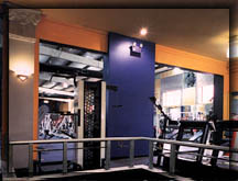
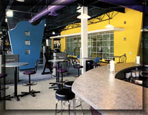
It was decided to build a 1,000 sq. ft. addition to connect the two wings. Since this atrium addition was central to the layout, it would also house the entrance area, juice bar and check in desk. However, this did create a unique situation, the gym would be split into two wings. A typical solution may have been to split the services and put cardio and aerobics into one wing, and all the equipment into the other. As architects we always try to look at the natural resources that a space can offer. By working with rather than against a natural resource, unique spaces of distinction can be created. Clearly this was a natural resource. We decided to create two gyms in one utilizing the two wings. Since we were trying to accommodate a broader market of potential members, this made good sense. In one wing we could house the general needs of a full facility. The free weights, circuit training, cardio decks, sales and large aerobics. In the other wing we decided to make a soft area. An area where someone out of shape could work with a personal trainer to ease into a schedule without intimidation, the soft area could also be used for fitness for seniors. By having two completely separate work out areas the club gains the flexibility to create an atmosphere for individuals that share similar levels of development. The soft area houses the locker rooms, a small cardio deck, circuit training, stretching, abs., light dumbbells, the smaller aerobics room, physical therapy and a chiropractor.

The Facility has been operating for 10 months, and so it has been a great success. The members really appreciate the diversity of spaces within the club. Diversity helps keep members form getting bored. An example are the three cardio decks. This gives members a chance to get different views every time they do cardio. Three decks don't cost any more than one does, but it keeps the spaces more intimate and personal while adding diversity. Major decks do look impressive but if you the guy in the third row of 30 treadmills its not much fun. Although there is diversity, all the spaces should flow into one another. Its important to not enclose areas that may intimidate someone from interring. Another technique we employed a WOW is there is never only one way into an area and one way out. All areas have a circular flow. This works great for the sales tour, there is a natural path to everything without having to back paddle out.
An important note to remember is that this project took three months to design. The plan was refined and developed until my office, the clients and the gym's staff felt comfortable with the layout. Once we were confident of the plan we studied all the interior elevations until they felt right. Everything was choreographed. What the person experiences should not be left to chance.
Recently a prospective client asked me to design his club, but he didn't want to spend the time or money on the plans. "Cant you just give me the colours to use? he said to me, "that's all the members see anyway." I tried to explain a great club could be painted all white and still feel great, that true success is a result of great efforts and careful planning. Certainly this is something WOW! fully understands and appreciates all the way to the bank.
Rudy Fabiano is the Principal of Rudy Fabiano Architects. His firm specializes in the design of fitness facilities.